About
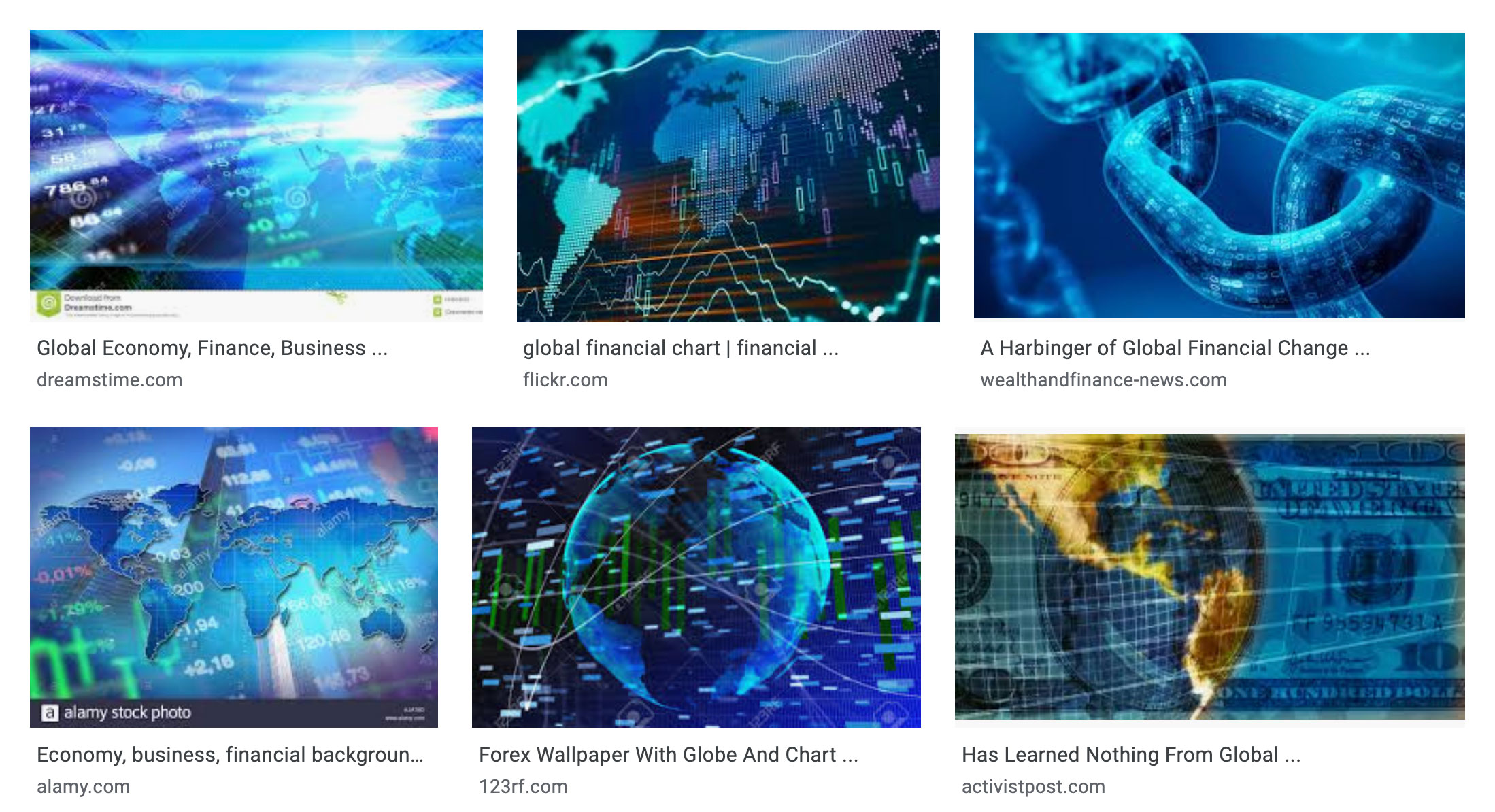
Why is global finance blue? When you Google “global finance” there is no mistaking that a certain repertoire of networks, numbers, translucent images, and glowing blue lights — all overlaid atop the earth — have come to stand for ‘the global’ in finance. In these images, the world has been subsumed by finance. Global finance leverages the power of the digital to render the whole earth in the image of capitalist rationality. This is troubling because there is no doubt that financialization has had global repercussions. Ever since the first modern stock market was constructed in Amsterdam to raise capital for the Dutch East India Company, the stock market industry has been “global” — or at least entangled with particular planetary webs of colonial expansion.1 But the images that advertise finance’s domination as ‘global’ say nothing about the felt effects of finance. Nowhere in these abstract images overlaid with low opacity strings of numbers and symbols can we see the flow of capital in and out of developing nations or the profiting from the worsening climate crisis. As a visualization of data, these images do more to occlude the relation of data to the earth, than to represent it.
But why is global finance blue? When I don’t know something, my knee jerk reaction is to Google it. When I Google “blue meaning” Google informs me that
Blue is the color of the sky and sea. It is often associated with depth and stability. It symbolizes trust, loyalty, wisdom, confidence, intelligence, faith, truth, and heaven. Blue is considered beneficial to the mind and body.
To say blue is the color of the sky and the sea is to say it unifies the earth without being earthly. Blue “transcends” the gritty, sandy, woody, and green. Blue makes and equivalence between the depth of oceans and stability of the banks. And, unlike galvanizing colors like yellow, orange, or red, blue neutralizes. Blue is dependable, like the status quo. Perhaps blue is the color of global finance for the same reason why so many social media apps gravitate to blue. It projects unobjectionablity.
We know from Maggie Nelson that there is also a reason why the sky is blue:
the blue of the sky depends on the darkness of empty space behind it. As one optics journal puts it, "The color of any planetary atmosphere viewed against the black of space and illuminated by a sunlike star will also be blue." In which case blue is something of an ecstatic accident produced by void and fire.2
If blue is an ecstatic accident produced by void and fire, what voids and fires produced global finance’s blueness? Why does finance need to advertise itself as blue? What about the globalization of finance requires drawing upon cliches of blue neutrality, depth, or transcendent unity?
The goal of my project is to derive alternative data visualizations to counter the visualizations of data employed by “global finance”. In resistance to the corporate image of finance, the guiding constraints of the representations I wish to produce are simple:
- data is grounded
- data is tethered
- data is messy
- data is void and fire
Though the history of stock exchange digitization is fraught with complex contests between many organizations, no exchange has been as influential in the globalization of electronic financial markets as NASDAQ. NASDAQ (National Association of Securities Dealers Automated Quotation) was founded in 1971 as one of the first stock markets to automate the information infrastructure needed to manage the records produced from stock market transactions.3 In the 1960s, Wallstreet was suffering from a 'paper' crisis.4 Millions of dollars were lost annually to inefficient paper processing. The crisis was an opportunity for companies specializing in new computer technologies to compete with the most dominant national market at the time: the New York Stock Exchange. NASDAQ's automated quotation system was highly successful. Now NASDAQ has become the leading provider of stock market information infrastructure to other stock exchanges around the world.5
In the 1980s and 1990s there was a period of financial expansion, both nationally and abroad. This period accompanied aggressive rhetoric from both the left and the right about the global dominance of global financial capitalism. Whether in financial marketing discourse or in critical theory, finance is portrayed as an abstract, global, diffuse and homogeneous power. In her ethnographic work on Wall Street, Karen Ho shows how both leftist critics and financiers often employ similar rhetorics of capitalist globalization, discursively constructing financial capitalism as a "total social fact."6 However, behind the rhetoric of inescapable capitalist financialization, Ho finds that the globalness of financial globalization is more aspirational than actual. While I am concerned with the globalization of financial infrastructure, I follow Karen Ho in the belief that financial capitalism and globalization is better addressed with the empirical study of the concrete connections that financial capital operates through.
The goal of this project is to assemble a set of digital methods to study financial expansion in its historical specificity. Unlike the bias of existing financial data repositories toward prices, commodities, and small time intervals, the overarching assumption built into the tools I developed for this project is that history, place, people, and institutions are critical categories through which financialization can be analyzed. Thus, the task I gave myself was to create a suite of processes that could distill a large volume of discursive data into more structured data about time, place, people, and institutions. As an information studies researcher, I am highly skeptical about the accuracy of algorithmic processes. However I also believe in the value of being able to read at different scales. A constraint I gave myself was to preserve connections to the original source, and never to destroy data by "cleaning it" 7. Though the tools I develop do manipulate the original data with many assumptions, I used document indexes and entity indexes to preserve the connection between data elements and the original sources. Thus, despite the noise that these data generation processes introduce to the original data source, they can be accounted for when reflecting on the visualizations they helped produce.
Sources
The source of the data used in this project is Factiva. Factiva is a global database of news articles and business information resources owned by Dow Jones.8 As a data source for studying the globalization of NASDAQ, Factiva has many affordances. Factiva contains many digitized records from the 20th century. Compared to other competing business intelligence databases, Factiva has more global news sources. As an entity owned by Dow Jones, Factiva is biased towards business news and is a source of business news for many actors in the financial industry. In my case, this bias is favorable, because it is a definite source of information about the history of NASDAQ. Moreover, Factiva's articles have rich data about times, people, places, events, and organizations.
However, Factiva comes with several limitations. The data is stored in an inaccessible format and Factiva actively prevents large downloads of data by barring users from downloading more that 100 articles at a time and by requiring users to pass through CAPTCHA. Furthermore, Factiva's data is largely unstructured. Except for metadata tags like author, date published, and source, Factiva does not have rich semantic segmentation of people, places, or organizations.
To transform Factiva's data into data with the format needed to visualize it, I had to run the text through several levels of processing. Each of these operations on the data contain hidden assumptions, models, and biases that produce errors in the data generation process. For example, named entity recognition uses a machine learning model to categorize text elements into pre-chosen categories. The model used to parse my dataset could not always correctly distinguish places from names. Furthermore, some foreign names were not recognized as person names. Nevertheless, the dataset is very rich. It includes a wide variety of information about people, organizations, places, events and dates relevant to the history of NASDAQ.
Process Pipeline
In this section I describe the process by which I transformed the data from Factiva into data suitable for visualization. You will find links to Google colab notebooks for each python process. Feel free to reuse the code for your own projects!
Step 1. Download documents from Factiva
To obtain the data I searched "NASDAQ" including historical sources in Factiva's database. I sorted the results historically from oldest to newest. Then, I manually downloaded the articles in batches of 100 until reached 1989. This step produced a text file of 10,000 articles that mention NASDAQ.
Step 2. Extract metadata from documents
After downloading the data, I used an open source library to extract the metadata from the documents. The metadata was limited to article level information about the document, such as author, date published, headline, and publisher. Date published was especially useful to me because it allowed me to visualize the history of the corpus. In addition to extracting metadata, I created a document index so that data derived from further transformations could be linked back to the original document.
Step 3. Process articles using Named Entity Recognition
To extract the semantic entities that are relevant to my research, such as people, locations, and organizations, I used a named entity library called spaCy9. SpaCy uses a machine learning model to differentiate between a variety of named entities, such as People, organizations, and locations. This produced at dataset of 817,925 entities.
Step 4. Create an index of unique entities
The data obtained by spaCy was very messy and included many duplicate entities. To standardize the data for further processing and visualization, I used fuzzy deduplication to create an index of unique entities. For example "NASDAQ", "Nasdaq", and "nasdaq" were all assigned the same entity index. This process reduced the list of unique entities to 133,266 named entities. Though this process produced many errors and misclassifications, it is necessary in order to find interesting patterns between entities.
Data Visualizations
The data visualizations produced below were generated with several different tools including Tableau, D3.js, and cytoscape. The following visualizations help answer the following questions: 1) how has financial discourse in the news changed over time, 2) what are the geographies of financial discourse, and how has the geography of associations to NASDAQ developed across history, and 3) what are the social and organizational centers, or anchoring points, of financial news?
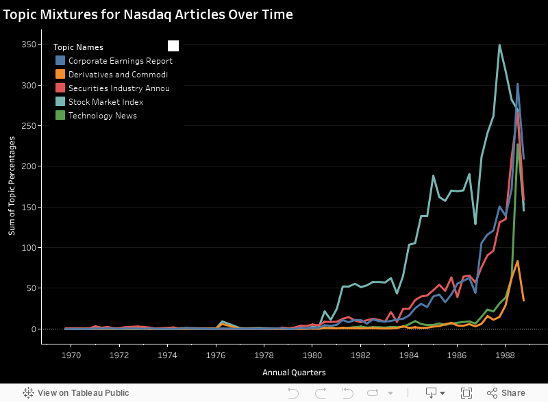
Topic Modeling Financial News
To plot how financial discourse changed over time, I generated a topic model. This visualization represents the percentage of topics in each article from 1969 until the beginning of 1989. The topics were produced using Latent Dirichlet Allocation (LDA). LDA is non-deterministic statistical model that generates a set of lists of words associated with a corpus of documents. Each list represents the corpus as a cluster of words and can be used to divide the corpus into a set number of topics. There are several implementations of LDA. The particular implementation of LDA uses a combination of natural language processing library for python. To run LDA, I adapted a medium post by Yanlin Chen for Google colab.10
Google colab notebook: Implementing LDA in Python
Topic modeling requires a level of subjective judgement in deciding how many topics should be included and in discerning the difference between word clusters. After running the LDA with different parameters several times, I concluded that the process could not find more than 5 meaningfully different categories. If the model attempted to produce 10 topics, several of the topics would be too similar to one another. Even with only 5 categories, the topics seems quite similar.
Analysis
As shown in the chart above, the relative composition of topics has not significantly changed over time. In the visualization, the most common topic is "Stock Market Index." While it might be somewhat difficult to disambiguate from the other topics, this topic represents articles that are more about the state of the stock market as a whole, understood through market language like buying, selling, rising, and falling. The next two popular topics are "Corporate Earnings Report", and "Securities Industry Announcement". Unlike "Stock Market Index", these articles are more focused on specific developments, whether in a corporation or in the securities industry. While there is significant overlap, the language is centered around the corporate management of firms, rather than the market as whole. The keywords are boards, presidents, earnings, revenue, announcements. The "Technology News" topic is news that focuses on technological development, computers, design, and new products. Lastly, the "Derivatives and Commodities Market" topic is related to news about financial products offered on stock exchanges. It seems as though these categories maintained a fairly consistent relationship with one-another across the development of NASDAQ. What is most striking is the exponential increase articles that contain these topics in the 1980s. It is unclear if this reflects a bias in Factiva's database towards newer documents, or if there was a substantial growth in financial news publishing.
Historical Map of Locations Mentioned in Documents about NASDAQ
This is map uses the named entities from the first 10,000 articles on NASDAQ. The named entities were generated with the spaCy natural language processing library. Using the library, I created program that labels entities in the documents with the tags "GPE" for geopolitical entity and "LOC" for location. A geopolitical entity is an area region like "Serbia" or "The West Coast" whereas a location is more specific place like "Russia" or "California". Using the Google Places API, I transformed entities tagged as a location or geopolitical entity into latitudinal and longitudinal data.
Each dot represents the first time a new location was mentioned in a document. The location tags are then correlated the date published of the original document from which they were derived. Below the map is a timeline and bar-chart of the locations mentioned per year. The slider under the chart enables the user to visualize the spread location mentions over time.
Even with Google's API, which is the best API for geocoding, the process is a source of error because of the ambiguity in place names. For example, it appears on the map that the first mention of a location outside of the U.S. was off the coast of Africa. This is an erroneous artifact created by Google's API. When Google has insufficient information, it gives the data element a lat,long coordinate of 0,0 which happens to be off the cost of West Africa. When interpreting this data, it is important to be able to link it back to the original context using the document ID. By hovering over a dot, the tool tip provides metadata on the document that the named entity was extracted from.
Google colab notebook:Geocoding locational entities with Google API
Analysis
This map reveals the uneven globalization of discourse between the founding of NASDAQ and 1989. The first locations to be mentioned in news articles associated with NASDAQ are locations in the United States. This trend continues through the 1970s until the beginning of the 1980s, when there is a mention of Manchester and NASDAQ in the same article. In the first half of the 1980s, more locations in Europe and East Asian populate the map. The number of locational mentions begins to accelerate, likely because the total number of articles in the database also grew exponentially. Independent of the total number of articles is an increase in the number of mentions of locations outside of the US. Nevertheless, the majority of mentions are constrained to the United States and Europe. Outside of the Global North, locational mentions are much more sparse, and seem congregated along coastal cities. Locations in the land locked interiors of South America, Africa, and Asia have very few mentions.
This visualization reveals two predominant trends: 1) Expansion 2) uneven globalization. First, the historical time slider clearly reveals a narrative of expansion, beginning in Wall Street and slowly spiraling out to reach a multitude of locations around the world. Second, despite finance's persistent use of the "Global" in advertising and rhetoric, the globalization of financial news discourse has been considerably uneven. The financial news in Factiva's database is clearly biased towards the Global North. Regardless of whether this unevenness is a bias in Factiva's data set or if it actually reflects financial discourse, this is an important finding because Factiva positions it self as a "global news source" for the financial community.
Centers in Networks of Financial Discourse
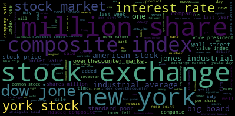
In this word-cloud produced from the Factiva dataset, the dominant phrases in the articles associated with NASDAQ are "stock exchange", "millions", "new york", "share", and "composite index". This word cloud reveals financial news' proclivity towards quantitative information as well as the regional bias towards New York, as a world center of finance. But Factiva news articles also contain a tremendous amount of information about people and institutions. To make this hidden information more visible, I generated network graphs of the people and institutions mentioned in NASDAQ.
To generate the network, I iterated through the entity index and the document index to find instances of entities being co-mentioned in the same document. I recorded each pair of entities as a source and target in an edge list. I repeated this process for all entities tagged "Person" and all entities tagged "Org." Unfortunately, the lists of entities were too large to graph with the D3 visualization tools I originally planned to use. I had hoped to create a more interactive visualization, but because of the size of the datasets I opted to create a static visualization with cytoscape instead.


Analysis
From the visualizations it is evident that the organizational network is more numerous and has a denser network of nodes. In contrast, the social network is more sparse and less densely interconnected. The social network also appears to be more hierarchical, with many branching nodes that are only connected to the larger network through a single other node. Additionally, there are several clusters of individuals that form island networks that do not connect with the main social graph. In the organizational network, it is hard to visually distinguish the most central nodes from other nodes because the nodes are all so densely connected.
According to network statistics, the institutions with the highest degree centrality are Dow Jones, the New York Stock Exchange, and NASDAQ. In the social network, the individuals with the highest degree centrality are Paul Volcker, Ronald Regan, and Micheal Metz. During this period Paul A. Volcker was the chief of the Federal Reserve and was most known for the Volcker Shock: a 20% interest rate hike designed to stimie 1970s inflation.11 Ronald Regan was the president during this time period and is responsible for instituting many policies that promoted the financialization of the U.S. economy.12 Unlike Volcker and Regan, Micheal Metz did not hold a position in the government. Micheal Metz was a stock market strategist and commentator.13
It will require further analysis to associate the individuals in the dataset with their employers and their professions. However, from an analysis of the top most central figures in the dataset, it appears that the most interconnected people across the corpus are stock market analysts and commentators. This is unsurprising because their profession implicates them consistently with NASDAQ.
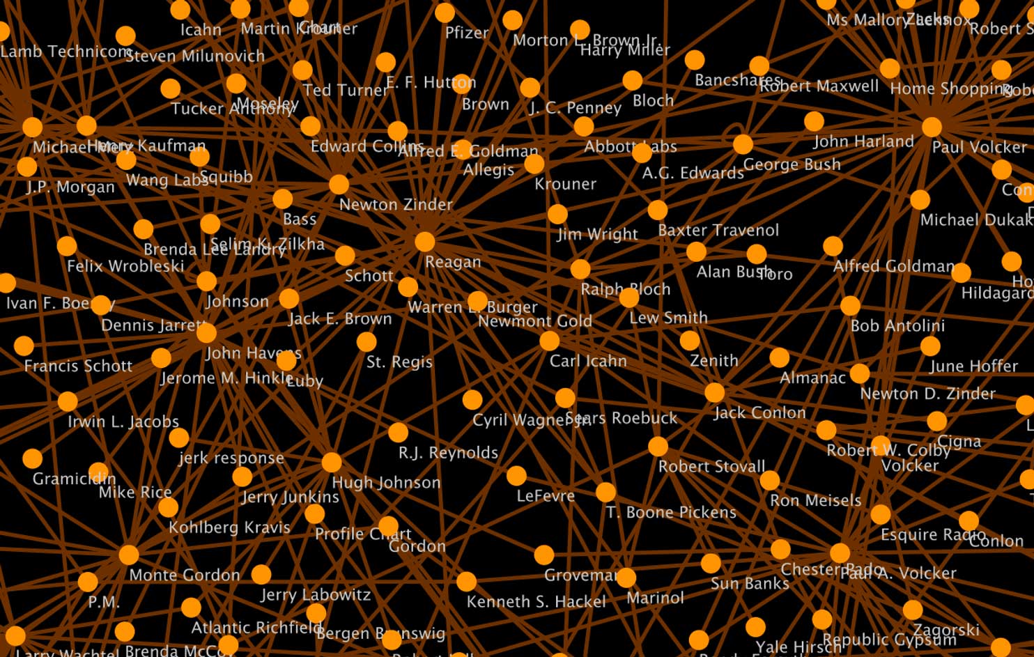
Apart from the humorous miscategorizaiton of J.P. Morgan and J.C. Penny as people, and not institutions, the close up of the center of the social network graph does show the two individuals with the most centrality: Ronald Regan and Paul Volker. This visualization demonstrates the social world that financial discourse is embedded in. As Polanyi argued in The Great Transformation, the economy was always embedded in society, and when 19th century social institutions sought to dis-embed the economy from society through laissez-faire policies, the consequent disruptions of life prompted social alliances to re-embed the economy in society once again.14. In contrast to the liberal disposition to regard government action as ‘intervention’, Polanyi contends that government action is a prerequisite and a constant feature of liberal markets. Polanyi's thesis is reconfirmed in the data. Ronald Regan and Paul A. Volcker --two government officials-- are central to the network of financial discourse.
Conclusion
The primary goal of this project was to develop research tools to study the globalization of NASDAQ in historic specificity. I aimed to produce data visualizations that go against corporate visualizations of "Global Finance." To do so, I created a series of python based processes that transform textual data into visualizable datasets. The visualizations depict the planetary scale expansion of NASDAQ, but they do not show a world entirely subsumed by finance. Instead, these visualizations reveal the uneven relations financialization has to times and places.
References
-
[1] Henwood, Doug. (1997) Wall Street: How It Works and for Whom. Verso
-
[2] Nelson, Maggie. (2009) Bluets. Wave Books
-
[3] Solomon, Lewis. (1999) The Impact of Technology on the Trading of Securities: The Emerging Global Market and the Implications for Regulation, 24 J. Marshall L. Rev. 299
-
[4] Kennedy, Devin. (2017) The machine in the market: Computers and the infrastructure of price at the New York Stock Exchange, 1965–1975. Social Studies of Science. 47:6.
-
[6] Ho, Karen. (2010). Liquidated: An Ethnography of Wall Street. Duke University Press.
-
[7] Rawson, Katie and Muñoz, Trevor. (2016). Against Cleaning
-
[10] Chen, Yanlin. (2018) How to Build an LDA Topic Model for Text Analysis. Medium
-
[11] Krippner, Greta. (2011)Capitalizing on Crisis. Harvard University Press
-
[12] Ibid.
-
[13] Staff (2008) Oppenheimer Strategist Michael Metz Dies at 79. Reuters.
-
[14] Polanyi, Karl. (1957) The Great Transformation. Beacon Press.